TSR Logo

Fido said:
I think that we should respect these reservations about an overt display of patriotism. It is obvious to any visitor that most of us are in the UK. The internet is global and perhaps we should embrace that.

How very well put. We're not too keen on flag waving here either.
 
Needs work but it's a start.

tsrlogo2.jpg
 
The idea was to have a logo that looked like a "stock" blade at a glance but obviously isn't hence the modern font choice sans serif but I will put up some versions with font variations

My initial thoughts are that the "UK" script is too pronounced and a touch on the large size and "the shaving room" text could probably do with lengthening, depends in on the font choice mainly.


Safety_Razor_Blades.summ.jpg

Stainless_Double_Edge_Blade.summ.jpg

Stainless_Steel_Double_Edge_Razor_Blade.summ.jpg


I quite like the less than perfectly aligned etching on these Chinese blades, fitting the largest font they can where they can. It gives them that "disposable" quality I suppose.
 
I mucked about with quite a bit of lettering in place of the locating slot, but I found that once it starts to loose that original symmetry it ceases to look like a blade any more. It really is the shape and symmetry of the slot that makes it instantly identifiable as a razor blade otherwise it just looks like lettering on sheet metal.
 
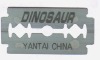
A bit more finished, the colour tone is such that it is reflecting a bloody bathroom scene.
The blood stain, glue spots and lens flare also give it more depth.
I have played around by making it look more like a Gillette blade with text positioning, font, arrows, numbers etc
but it became too fussy for something so small so I removed most of it.The space left in this case is as important as the text.
Maybe a Gillette arrow pointing to "theshaving" is a possibility maybe it could take that.
I abandoned the "text as slot" idea entirely as it became rather lost when scaled down to the right size for logo.
I think the concept is close to being resolved but its a little bit more edgy than members may prefer.


[attachment=0]
 
I like it. I like it a lot. It is rather modern, but I don't see any harm in that. I know another well known shaving site wishes us all to live in the past and adopt 'gentlemanly ways' again, but that's not really what we're about here. I know some of the gear we use is old-fashioned but we pretty much all appear to be people who live in the 'now'.

Anyway, the only thing I might change is the colour, making it the usual colour of a blade. That said it could look a tad bland as a logo. Also if the blood remains (nice touch) it could start to look gruesome. :eek: Bear in mind these are the thoughts of a man who has stayed up way past his bed-time, even if it is Friday. Eyelids are drooping, brain is flagging...

Goodnight! :D
 
I once sat through endless meetings to decide a logo for the New Forest. 30 years ago. After I retired, they changed it - no connection! But they haven't had the power of conviction. It's used on all communications. But half the public buildings still have the old logo. plus thousands of street signs.
We won't have that problem. But we can experience the difficulty of design by "committee"
I have to reluctantly confess my preference for simplicity. The design is excellent.. But I would stick to a shade of grey, and no blood. That's what we want our shave to be: bloodless.
 
Back
Top Bottom